principles and practices
fab academy week 1
This week was the kick-off of Fab Academy! We were introduced to the program and the documentation expected. I created this new section on my website where I will be posting each week my reflections for each class and documentation for the challenges. Each challenge will also have a git repository to make the files we created accessible easily.
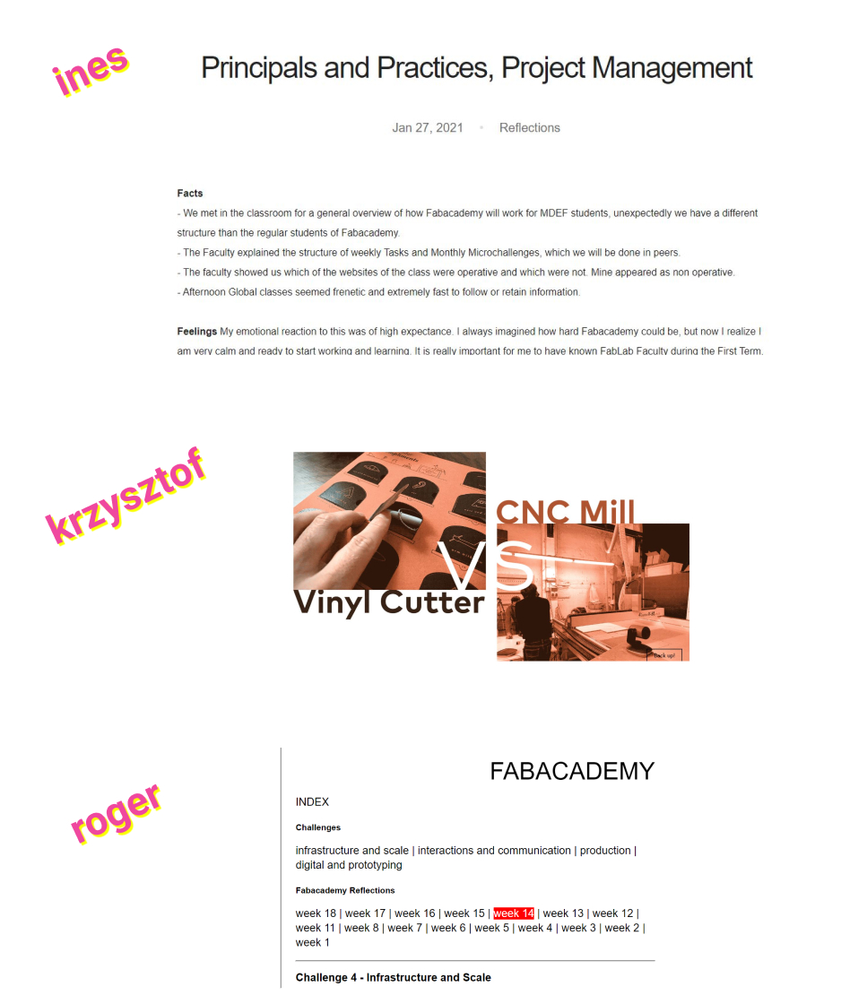
The first assignement was to explore among last year MDEF students’webpages to see what kind of documentation was interesting to us. I found these 3 interesting for different reasons:
consistent struture : In her weekly reflections, Ines keeps a consistent structure repeating each time : Facts, Feelings, Findings, Future. I find it interesting and will try to do it next week with categories that I think are useful to me. I think it will help me keeping more regularity in my documentation process and take the time to document more than "facts".
gifs and images : For each weekly task, I noticed Krzysztof creates an image or a gif. It makes it very pleasant to browse through the different weekly tasks and gives it a more personal and lively touch. I started using gifs when we worked on "tech beyond the myth" track last term but then I didn't continue. So it might be the moment to start again :)
simple and clear navigation : I liked Roger's navigation index through his website and the fab academy section. It is simple and yet very easy to understand without any useless effects. This is not only about the fab academy section but having this static part on the left side of the website also helps knowing where we are and not feeling lost.
